Omoove
Messaging | Content | Design
Sales Collateral Development
The Client:
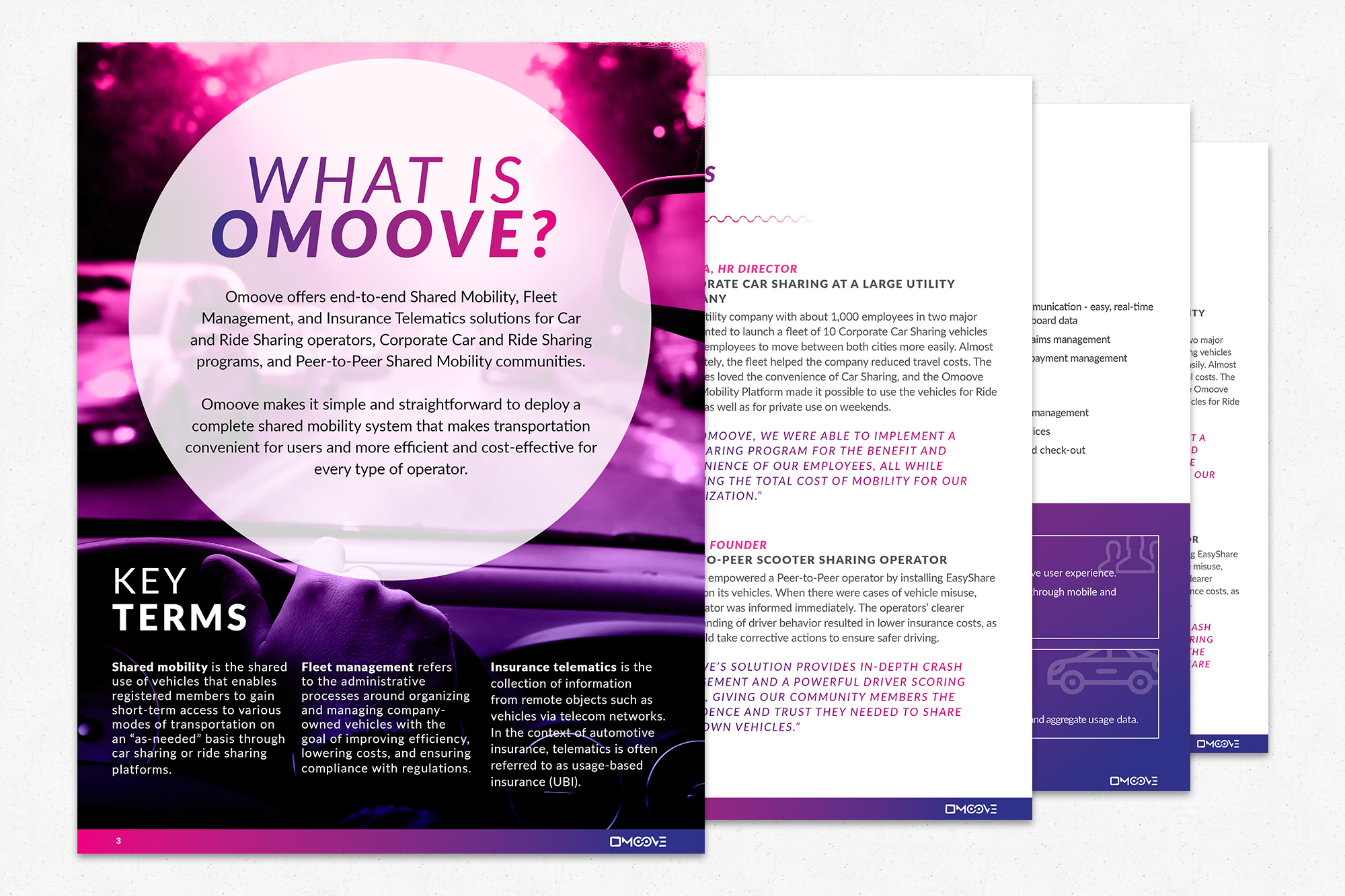
Omoove offers end-to-end Shared Mobility, Fleet Management, and Insurance Telematics solutions for Car and Ride Sharing operators, Corporate Car and Ride Sharing programs, and Peer-to-Peer Shared Mobility communities.The Project:
Omoove is based in Italy, but is rapidly expanding to include offices all over the world. As part of its U.S. launch, the Omoove team wanted to create new sales and marketing collateral that was localized to the American market in terms of positioning, messaging, and design. Specifically, the team wanted an attractive brochure that explained Omoove’s value propositions, as well as a pitch deck that could be used in sales presentations in the U.S. market. One of the major obstacles Omoove faced in creating these documents was the fact that the different solutions, add-ons, and devices did not have easily understood naming conventions. For example, the Omoove Shared Mobility Platform was the basis of the product, but there was also “MyCarShare” and “MyRideShare,” which were both built on the Shared Mobility Platform, and offered car sharing and ride sharing solutions respectively. These are two different products, but in Omoove’s existing collateral, it was not totally clear whether these were separate products or if they would be used together. This is to say nothing of the nearly unlimited combinations of different configurations, APIs, and devices that could be chosen to further customize the user experienceThe Solution:
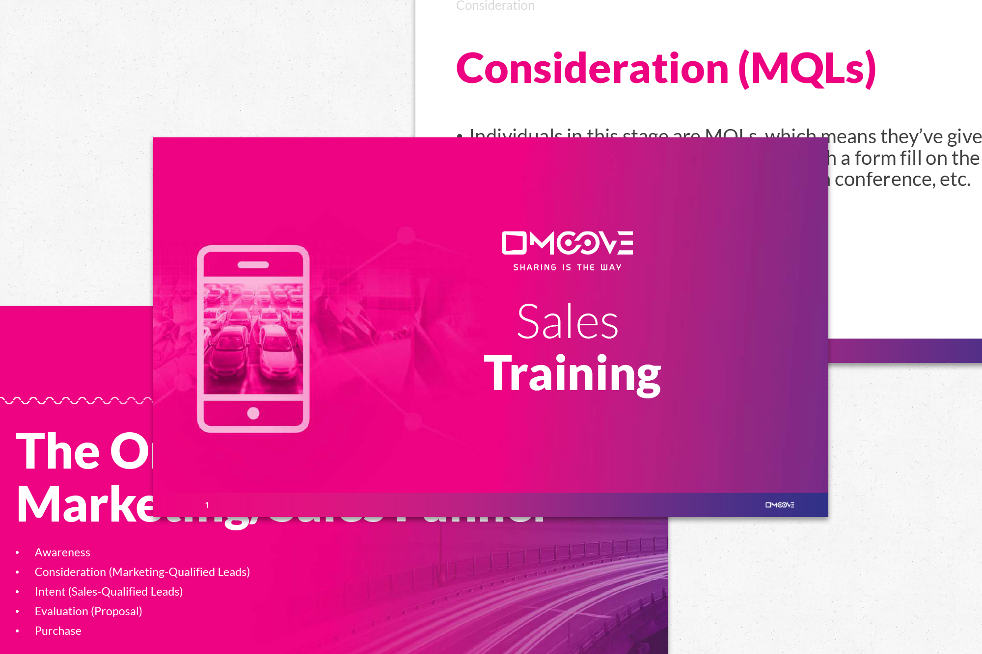
The goal of any good brochure or sales deck is to make the value of the offerings as crystal clear as possible, without an excess of jargon. The brochure would be available for download on the website and in print form at tradeshows, and had to accessible to a wide variety of audiences. The sales deck went into more depth than the brochure, but ultimately had to be understood by audiences with varying degrees of knowledge on the industry and product.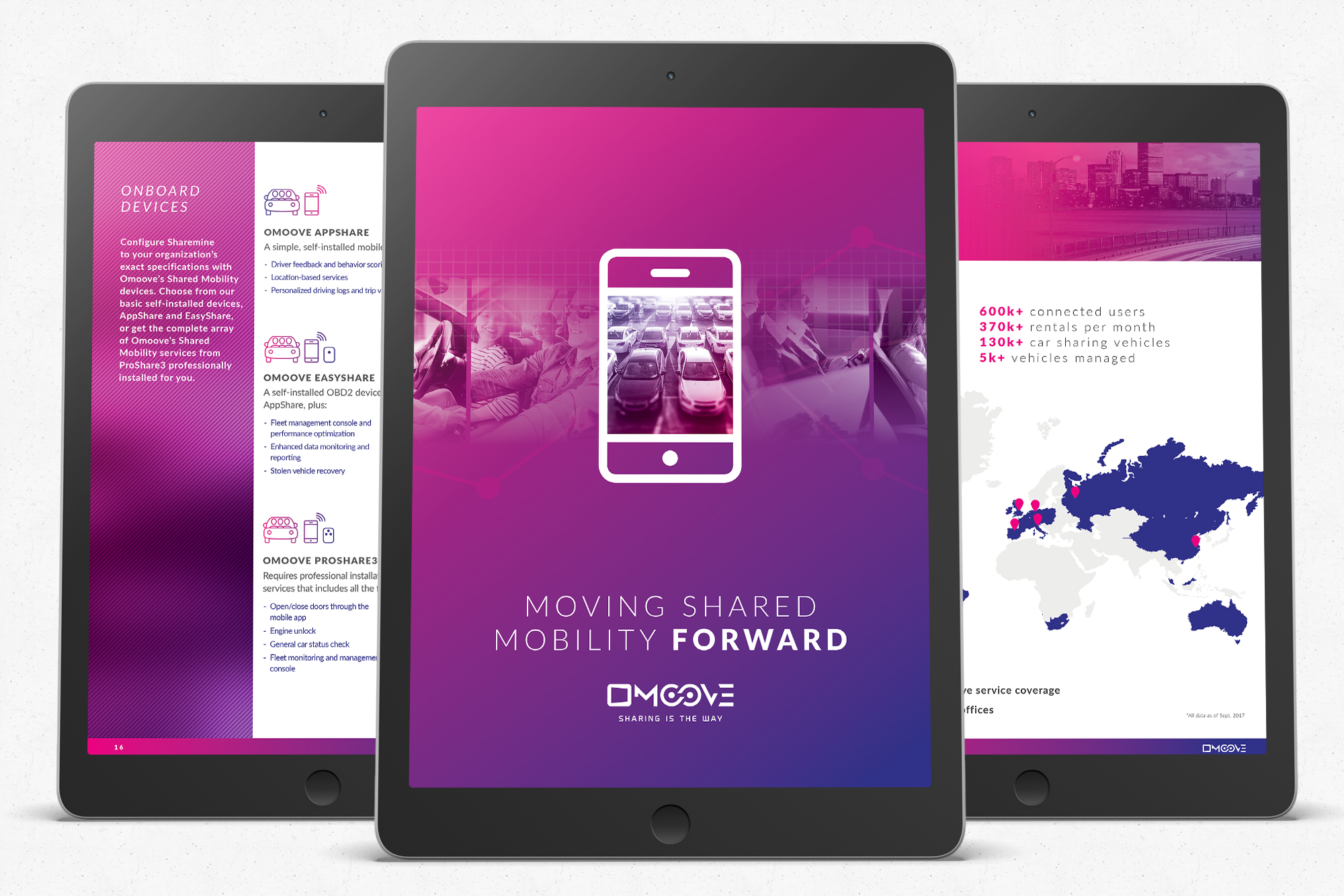
 Ideometry first worked with the Omoove team to create a new naming convention that would simplify the product offerings and make it easier to understand how all of the solutions, add-ons, and configurations work together.
We started by creating a hierarchy out of the information in order of how important each part of Omoove’s solutions are to understanding the whole offering. Based on conversations between our team and theirs, we simplified the naming conventions of the car and ride sharing solutions by naming them both “Sharemine.” By treating it as one product that can be configured for either car or ride sharing based on the user’s needs, we made it easier to understand that it’s one platform with a single solution built on top of it.
Once readers had an understanding of the main product, we went into greater depth on how the many configurations and optional add-ons augment the platform based on the user’s specifications. This made the flow of both documents very logical and grew the reader’s knowledge cumulatively.
Additionally, throughout the brochure and sales deck, we made sure that definitions of unfamiliar terms were clearly defined in everyday language, so non-technical readers could better understand the industry and products.
Ideometry first worked with the Omoove team to create a new naming convention that would simplify the product offerings and make it easier to understand how all of the solutions, add-ons, and configurations work together.
We started by creating a hierarchy out of the information in order of how important each part of Omoove’s solutions are to understanding the whole offering. Based on conversations between our team and theirs, we simplified the naming conventions of the car and ride sharing solutions by naming them both “Sharemine.” By treating it as one product that can be configured for either car or ride sharing based on the user’s needs, we made it easier to understand that it’s one platform with a single solution built on top of it.
Once readers had an understanding of the main product, we went into greater depth on how the many configurations and optional add-ons augment the platform based on the user’s specifications. This made the flow of both documents very logical and grew the reader’s knowledge cumulatively.
Additionally, throughout the brochure and sales deck, we made sure that definitions of unfamiliar terms were clearly defined in everyday language, so non-technical readers could better understand the industry and products.
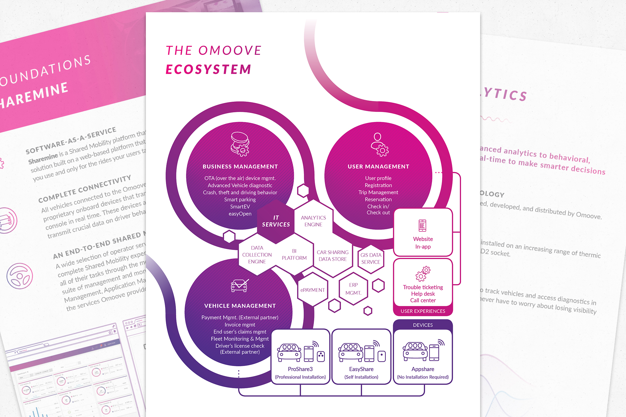
 From a design perspective, we used Omoove’s existing brand colors and overall aesthetic to craft easy-to-follow pages and slides. Additionally, we solved the problem of presenting a comprehensive look at the entire Omoove ecosystem by creating a graphic that incorporated the various components in a visually attractive and understandable way.
If you don't want to fill out a contact form... (who does really?)
Feel free to call or email us: