Quorum
Branding | Messaging | Design
How We Designed This Credit Union’s Creative Campaign to Crush Negative Stereotypes and Expand Its Audience
Quorum Federal Credit Union is a financial cooperative based in several states in the Northeast and Midwest that serves over 70,000 members.
The project:
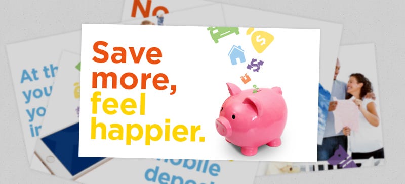
At the time Quorum kicked off this project, its brick-and-mortar branches advertised generic and promotional products at their locations via light boxes that house printed posters, digital screens, and handouts.
Quorum hadn’t refreshed its in-branch collateral in about two years, so it needed an upgrade. Quorum was looking for new evergreen posters to serve as a product and service-focused brand awareness channel. The secondary purpose of the posters was to initiate and encourage interaction with a branch representative.
There were a few core themes that had to drive the messaging on all of the campaign collateral:
- They had to distance Quorum from some of the negative stereotypes about credit unions in general: namely, that they’re behind the times and offer fewer products than big banks. In doing this, however, we couldn’t lose some of the positive associations consumers have with credit unions, such as great service and favorable rates.
- They had to be appealing to all age demographics in terms of visuals and messaging.
- They had to be evergreen. This meant the copy and design had to sell customers on the products without relying on exact rates, which are always subject to change.
The end result:
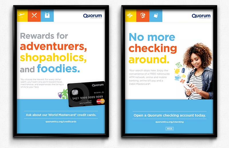

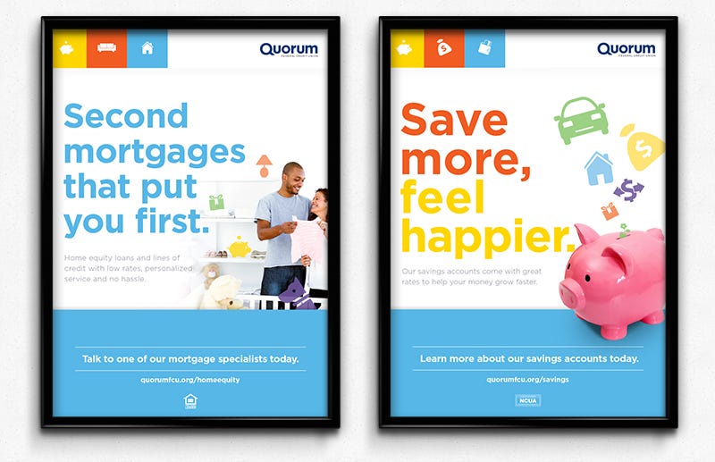
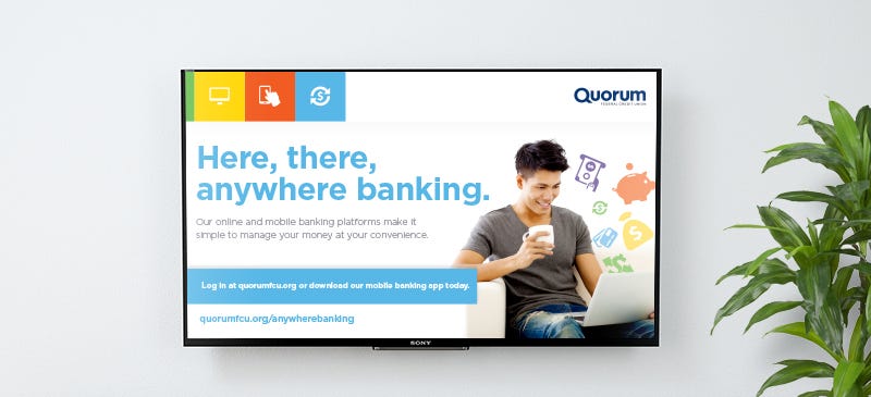
We knew that Quorum’s long-term goal was to become more approachable and attractive to millennial consumers, while still retaining its established customer base, which skews more toward middle age. For this reason, our copy presented a colloquial, yet professional and tone, and the bright and energetic visuals injected their brand with an approachable personality.
It’s difficult to really sell someone on a financial product in the space of a headline and subhead, so we had to use the space as wisely as possible. Each poster had to convey the core benefit of each product. The thread that connects all of the posters’ copy and makes them a cohesive whole was that Quorum offers modern, high-quality products with the time-tested devotion to expert, personalized service that credit unions are known for.